Saturday, December 15, 2012

2nd Annual Ornament Swap

Hi all,

This is my first Ornament Swap so I am a newbie. My partner was Miranda Ackerley of NY.  This is the beautiful ornament piece I received .  It is a triangular piece of copper with holes drilled into it. In the holes she wired in beautiful little crystal  to resemble ornaments. Then a cute green crystal and a small brown crystal at the bottom for the trunk. On top is a gorgeous green metal flower with a crystal in the middle. I can't tell if the flower is a button but it is as cute as can be.

The card that the ornament is hanging on is a paint chip with holes punched in it. How cool is that???? Talk about recycling!!!!

I had a great time with this Swap and can't wait to see the other ornaments.

Hop on over to Miranda Ackerley to check out her site and beauties.

Below are the rest of the participants. Hop on over to their sites and check out their ornaments.


Saturday, October 27, 2012


Ornament Swap 2012 1      Just to let you know about a new Blog Hop and Design Challenge. Stay tuned for more information.  Or you can to www.thestudiosublime.com and check it out!

Sunday, October 7, 2012

studio waterstone


Since many know of my love of photography, I have posted a picture of a "ginger" plant. The "pod" is red and it looks like it has gold dust, but it is really where the pod is starting to dry out. I don't know much about this plant, only that it is called a ginger plant...But I love the red pod... Check out the others at i heart macro with button above!


Thursday, September 20, 2012

September Challenge with Art Bead Scene


I can't believe it has been so long since I posted....been very busy. Trying to set up my online jewelry business. Anyway below is the picture we were given for the September challenge.  I had already started a piece with clay that had some of these colors so I went with it. 


Flora by Giuseppe Arcimboldo, 1588
Oil on wood, 73 x 56 cm
Private collection, Paris, France


About the Art
Flora is one of Arcimboldo’s most famous paintings, painted at the same time as Vertumnus, when he was at the height of his career. Although his work was forgotten after his death, over the last 100 years it has grown in popularity to be included in many contemporary forms. This particular painting was used as the 2009 cover for the album “Bonfires on the Heath” by the English pop band The Clientele.


 The leaf and main beads are clay. I worked the clay and came up with the design of colors then made the leaf and beads. It is strung on silvertone wire with brown and yellow glass beads, silver metal beads, and swarovski crystals. I attached two silvertone metal leafs to accent the clay bead.

Thanks for looking.

Friday, August 10, 2012

All Free Jewelry Challenge


Acrobat and Young Harlequin1 Join the AllFreeJewelryMaking Beading Challenge!

AFJ Aug 12- When I shop I try to pick up different beads that I normally would not use just to challenge myself.  The glass striped beads I picked up at Walmart in their $1 bin.  I added turquoise glass beads and two rusty brown ceramic beads and strung on memory wire.  I had fun with this challenge and was glad I was able to use these beads.


Check out more at http://www.favecraftsblog.com/join-the-allfreejewelrymaking-beading-challenge/

Tuesday, August 7, 2012

August ABS Challenge


About the Art
Few of Homer's watercolors rival this one for its effects of shimmering sunlight and steamy atmosphere, achieved through the rapid application of wet-on-wet surfaces, the broad and dexterous exploitation of the white paper reserve, and the judicious sponging of wet pigment, especially in the shadows, reflecting light off the water. This picture is also exceptional for the number and visibility of its pencil marks, not only to indicate some of the boats' rigging (and betraying the pentimento of a sloop in the background that the artist edited out), but also to enliven the rustle of the sailcloth lifted by a phantom breeze. By contrast, Homer, in masterly fashion, merely daubed in the figures freehand, sacrificing nothing of their form and weight—they even seem to speak.

About the Artist
Winslow Homer (February 24, 1836 – September 29, 1910) was an American landscape painter and printmaker, best known for his marine subjects. He is considered one of the foremost painters in 19th century America and a preeminent figure in American art.
Largely self-taught, Homer began his career working as a commercial illustrator. He subsequently took up oil painting and produced major studio works characterized by the weight and density he exploited from the medium. He also worked extensively in watercolor, creating a fluid and prolific oeuvre, primarily chronicling his working vacations.


Here is my submission for August ABS.  This necklace reminds me of all the colors of the sea and the bead reminds me of a fish. I loved doing this and some other ideas too if I get a chance to post them.

To get more information check out the ABS Blog


Friday, July 27, 2012

Stepping outside my comfort zone!

 For the ABS challenges you are supposed to use and "art bead"  and in this last challenge I had not done that, so Tari, kept pushing me and so I searched the internet just to see what new things I could do and come up with wire beads.  This is my first attempt but I know I will get better.  Enjoy. 

Wednesday, July 25, 2012

July Art Bead Scene continued

In addition to the post I all ready made for the July Art Bead Scene challenge, I have added three more bracelets and the piece I originally started before I found out about the bracelets.  My piece has all the colors and was me stepping out of the box and trying my hand at beading, fringe and chain work.  I haven't decided if I am going to make it a necklace or brooch....I may just frame it and put it in my workroom for inspiration. Enjoy mine and all the others at  Art Bead Scene  and see what a creative bunch we are!


Monday, July 9, 2012

July ABS Challenge


July Monthly Challenge

"Two Acrobats with a dog" by Pablo Picasso, 1905
Gouache, 105.5cm x 75cm
Museum of Modern Art, New York

About the Art
Our inspiration this month is from Picasso's his Rose Period. The Rose Period signifies the time when the style of Pablo Picasso's painting used cheerful orange and pink colours in contrast to the cool, somber tones of the previous Blue Period. The Rose Period lasted from 1904 to 1906. Harlequins, circus performers and clowns appear frequently in the Rose Period and  will populate Picasso's paintings at various stages through the rest of his long career. The harlequin, a comedic character usually depicted in checkered patterned clothing, became a personal symbol for Picasso..

Our new challenge wasWe have a new spin to our challenge this month.  We'd like encourage you to make a blue bracelet inspired by our challenge piece and consider sending it in to the 7000 Bracelets Project.  Take a moment to read about this program that offers awareness and support for caregivers of children with rare genetic diseases.  I know that many in our community have participated and there have been some wonderful blog hops, but I'd like to rally our readers together to donate at least 200 bracelets this month.  

I decided to make up some quick bracelets with blue and white beads and buttons that I can donate for fun. I love working with buttons!. They are on elastic cord since you never know who will be wearing them. I am still working on more, but I am posting these.

(NOTE: I don't know if anyone else is having problems, but when I post this, all I see are stripes, but if you click on it,it will show the true pic.....)


Wednesday, June 27, 2012


June Monthly Challenge

Nighthawks (1942) by Edward Hopper
Oil on canvas, 33 1⁄8 in × 60 in

About the Art
Nighthawks portrays people sitting in a downtown diner late at night. It is Hopper's most famous work and is one of the most recognizable paintings in American art. Within months of its completion, it was sold to the Art Institute of Chicago for $3,000 and has remained there ever since.
Josephine Hopper's notes on the painting starting shortly after their marriage in 1924, Edward Hopper and his wife, Josephine (Jo), kept a journal in which he would, using a pencil, make a sketch-drawing of each of his paintings, along with a precise description of certain technical details. Jo Hopper would then add additional information in which the themes of the painting are, to some degree, illuminated.
A review of the page on which "Nighthawks" is entered shows (in Edward Hopper’s handwriting) that the intended name of the work was actually "Night Hawks", and that the painting was completed on January 21, 1942.
Jo’s handwritten notes about the painting give considerably more detail, including the interesting possibility that the painting's evocative title may have had its origins as a reference to the beak-shaped nose of the man at the bar:
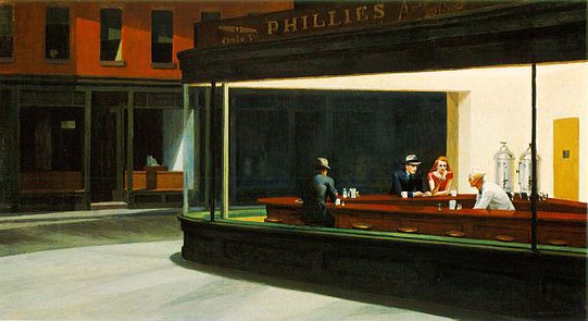
“Night + brilliant interior of cheap restaurant. Bright items: cherry wood counter + tops of surrounding stools; light on metal tanks at rear right; brilliant streak of jade green tiles ¾ across canvas—at base of glass of window curving at corner. Light walls, dull yellow ocre door into kitchen right.
Very good looking blond boy in white (coat, cap) inside counter. Girl in red blouse, brown hair eating sandwich. Man night hawk (beak) in dark suit, steel grey hat, black band, blue shirt (clean) holding cigarette. Other figure dark sinister back—at left. Light side walk outside pale greenish. Darkish red brick houses opposite. Sign across top of restaurant, dark—Phillies 5c cigar. Picture of cigar. Outside of shop dark, green. Note: bit of bright ceiling inside shop against dark of outside street—at edge of stretch of top of window.”
Hopper chose to paint a scene located at a sharply-angled street-corner, rather than at one of New York’s many right-angled intersections. This choice was not unusual for Hopper, who painted a number of other scenes of this kind of corner. A sharp corner gave him the opportunity to display his subjects from a nearly frontal point of view, and also allowed him to display the dimly visible street scene behind the patrons. Hopper often painted scenes in which a part of the exterior view could be seen through two panes of glass. The shape of the diner in Nighthawks, when seen from Hopper’s chosen angle (which is also the point of view of a passer-by walking past on the sidewalk), allows this second glass surface to fill the entire centre of the painting. The further pane of glass forms a rhomboid, close to the center of the painting and recalling, with slight distortion, the shape of the entire canvas, and framing much of the action.
The back window serves as a background for all three customers, but not for the server. Its variance from the shape of the painting as a whole also hides a curious symmetry that would otherwise be obvious: The head of the customer who is sitting alone is at the precise center of the frame-within-a-frame (which is also the exact center of the painting as a whole). Although they sit around a bend in the counter, the heads of the couple are directly to his right, so that a horizontal line, drawn precisely halfway between the top and the bottom of the canvas, would bisect all three heads. The entire human element in the painting is therefore contained within the lower right-hand quarter of the canvas.
As Jo Hopper's journal entry notes, the brightest spot in the painting is the “bit of bright ceiling” close to the hidden fluorescent light that illuminates the interior. The ceiling is obviously of limited relevance to any narrative that might be unfolding among the customers below; this is Hopper’s realism at work.
Outside the diner, dull colors predominate, as might be expected at night. Inside, the counter-top and the men’s suits are also dull. The two brightly-colored spots in the entire interior are the white outfit worn by the server and the female customer’s red blouse. Indeed, her red blouse and lipstick represent the only use of red in the entire composition, causing her to stand apart from everything else in the painting. Hopper left no written record to indicate whether the elimination of all other red is intended.


When I saw this, I thought of the 50's & 60's.  I had some buttons that were the red I wanted to use, and they reminded me of the pill box hats that were the fashion in that era thanks to Jackie Kennedy. My necklace is made up of the red buttons I had in mind. The cream and brown pieces I created from two buttons wired together.  They remind me of the coffee and cream that most people drank late at night at the diners. I filled in between the buttons with green beads and a clear glass bead with green lines in it.  That reminded me of the windows. I used wire that I curled at each end with jump rings to connect them. The connection for the back was a silver chain with a hook closure. I enjoyed this challenge and am looking forward to July's.


Saturday, May 26, 2012

Create a Lanyard


I have entered another contest. Following is the link - http://www.idwholesaler.com/lanyard-design-contest/index.html  . If you go to it and find mine and vote everyday, maybe I will win... Thanks.

Sunday, May 13, 2012


At Sweet Bead Studio, Cindy organized a button swap/hop. My swap partner was Shirley Moore in SC.  Since I am new, I didn't think to take a picture of the buttons she sent, but the buttons were wonderful.  I picked out the very cute clay heart button she created, then a green with white, a decorative gold one and a white pearl one. The green, white, and pearl buttons I stacked together with a little glue then attached a jump ring to the back. The cute pink and green heart I used wire and did little curly cues to the front to hold the heart, then twisted it in the back and attached it to the jump ring on the back of the button stack. The rest of the necklace is made up of button, and beads that I had.  I had a great time doing this and look forward to the next one.  Thanks Cindy! Below is a  list of other participants and the wonderful creations they made.Since I am new to blogging also, I hope the links all work . Thanks for looking!


 Kim Roberts and Partner unable to participate at this time.
Pam Ferarri and Stefanie Teufel (will share their reveal on a later date)
Stefanie Teufel and Pam Ferarri (will share their reveal on a later date)